
Products › Shitely Convert › Chart Studio
Chart Studio
Data that agrees with you.
Satisfaction, value and growth charts for any page, with the axis, slices and scale chosen for the message.
Overview
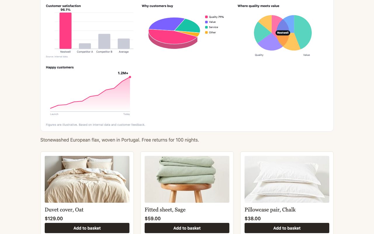
Chart Studio adds a Why customers choose us
panel to any page: satisfaction, reasons to buy, where quality meets value and customer growth, drawn from your data or from data that would suit you.
Each chart uses the house style. Bar axes start just below the lowest bar, so 96.1% stands three times taller than 95.2%. Pies are tilted so the front slice reads largest, and slices add up to what the message needs. Growth is shown as a running total, which only goes up.
How it works
- A bar chart on an axis that starts at the lowest value less 18% of the range, with unnumbered gridlines.
- A 3D pie with one labelled slice. The others have colours.
- A Venn diagram of two pie charts with your name in the middle, and an all-time cumulative line from
Launch
toToday
.
Shitely Convert
Works well with
UrgencyEngineEvery visitor arrives in the last ten minutes.Demand SignalsPopularity, shown on everything.LivePulseShow shoppers they are not alone.WasPrice™Every price, in context.SpinToWin™Make sign-up the best part of the visit.Cart AssistBigger baskets, automatically.Own BrandYour best products, under your name.ReplayWatch every session back.Smart CloseMonetise the close button.
Add Chart Studio to your site.
Free to start. No credit card required. Cancel by phone.